Friday, 27 March 2009

Kay Nielsen Illustration


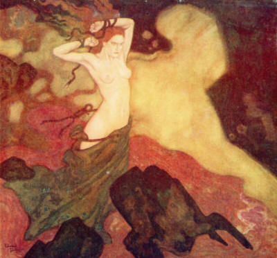
Always a pleasure to look
at one of these illustrations.
Don't you think!?

Tuesday, 16 December 2008

Harry Clarke Watercolour Masters

Harry Clarke is knon for his work on stained glass but he has extraordinary work on illustration. We could say that he's not only from the golden age but has also of pre-raphealite influence from the Victorian Age.

He has a similar approach as Aubrey Beardsley. Atlhough I find his work more minute and intricate. What makes it similar somehow is the figure drawings. The facial aspects are enlongated and the figures are tall and scrawny. Another mark is it being mostly black and white.

But he does have the odd work in colour. This particular one is rare and back from the 1920's and it's from a series illustrating Hans Christian Andersern's FairyTales. Wow, absolutely astonishing.

Harry Clark is of Irish origin and son of Joshua Clarke. He was born in 1889 and died 1930. He did other works, such as illustrated the Edgar Alan Poe's Tales of Mystery and Imagination and much more. All of are breath taking. If you're looking for his work on stained glass, then you should hop over to Ireland and go past The Honan Chapel on the University Grounds of Cork.

Monday, 27 October 2008

Ivan Bilibin

Ivan Bilibin was an artist that came from Russia. This means that his Art is Slavic.
He is also among my favorite illustrators.

When he traveled to the Northen part of Russia, he became acquanted with the Slavic folklore and the wooden architecture from those parts of the country.

His contribution to Russian Fairy Tales was original. He also went passed Cairo and Alexandia, only briefly, but came to settle in Paris around 1925.

He illustrated stories such as the Tale of the Golden Cockerel, Baba Yaga, Island Buyan. The Redfirebird is particularly beautiful. He was born in St.Petersburg, 1867 and died during the Leningrad Siege in 1942.

Wednesday, 20 August 2008

Kay Nielsen


Kay Nielsen is an artist from the late 19th century and also one of the names to be on the list of favorite illustrators. His origins are from Denmark and so his ilustrations have to do with Scandinavian Fairy Tales.


His most notorious is East of The Sun and West of The Moon, a norwegian tale that was introduced into literature by Peter Christen Asbjørnsen and Jørgen Moe. These guys were a bit like the Grimm Brothers who collected tales from folklore and storytellers. Andrew Lang, another folklorist, also included this in his Blue Book of Fairy Tales.


But we're here to talk about Kay Nielsen. Actually, more to share one of his paintings with you. He also illustrated fairy tales such as Hans Christian Andersen and the Grimm Fairy Tales. So here you have this beautiful image of one of my favorite illustrators. A Kay Nielsen illustration of East of the Sun and West of the Moon. Enjoy

Tuesday, 5 August 2008

Watercolor Paintings

Have a look at this one by Edmund Dulac from a Fairy Tale

There's a great variety of watercolor paintings. And if one looks carefully, we can find a wide variety of paintings that look quite apart and different from each other. Let's take a simple theme. A watercolored flower. These can be done with blunt thrusts of the brush and you can easily produce a good looking flower.

But what about those that really look real. Often, it's not only about the watercoloring technique but the time you spend with it. If you keep layering very light coats of watercolor paint. These keep overlappind and create depth and a stronger colour. That's why some watercolor paintings are better than others.

Just take a little longer and I'm sure you'll be impressed with the watercolor paintings you produce. Give it a go and put on some music while you're painting.

Monday, 21 April 2008

Watercolor Tips 5

A great technique to use watercolor, is using stencils or even objects as stencils. Take a simple leaf and place it on the paper. Then grab a spunge a water down the colors on a tray. One color at a time. Soak up the spunge and press it around the edges of the leaf.

It's fun. The watercolor shouldn't be too soggy. Just enough to leave the impression on it and as you're wartecoloring, you can also use different tones to color the inside. It's a rather childish effect but used with care and in the right place you can have a fabulous result.

If you're just interested in doing something simple, than a greeting card might be a good idea. Enjoy

Wednesday, 9 April 2008

Watercolour Tips 4


After some intense exploration of this medium, one refines the technique and learns from experience.

But besides using this painting technique, we can also add other techniques and apply them onto it. The more obvious would be to add colouring pencils. This conveys richness and particularly if you highlight details.

A very good way to put this in action is actually when incorporating patterns. It's a great way to get enough contrast but naturally blending in with the picture. Another good idea is to use it over one saturated colour and bring out tonal grading. The effect is astounding and work really well with bright colours.

However, these should be worked more towards the end. If you're able to control your watercolours relatively well, then it should not be a problem.

Next week we'll talk about inking over watercolors. Just check out this gorgeous painting of Arthur Rackham. Have fun.